Get Set Go — Sports Academy App
A SaaS app that gives sports academies one place to run daily operations — attendance, fees, scheduling, and support — while giving athletes and parents real visibility into progress for the first time.
Get Set Go is a SaaS platform built for sports academies — coaches, administrators, and athletes — to replace the spreadsheets, WhatsApp groups, and paper registers that most academies were running on. Built by Appiness Interactive, the product needed to work for two very different audiences on day one: the academy side managing operations at scale, and the athlete/parent side who just wanted a simple, trustworthy way to see attendance, fees, and schedules.
I worked on the athlete-facing mobile app and its supporting web presence — designing the day-to-day experience for a student checking in on their own progress, paying fees, and staying in touch with their academy.
The product was designed around three distinct personas, each with a different job to do inside the same platform: the Student, who needed a simple way to track their own progress and stay on top of fees and schedules; the Assistant Coach, who runs day-to-day attendance and class logistics; and the Head Coach, who oversees the academy's operations, staff, and business performance end-to-end. The screens below are all from the Student persona.
Student
Checks attendance, schedule, and fee status; pays and manages their subscription plan.
Assistant Coach
Marks attendance, manages class schedules, and handles day-to-day session logistics.
Head Coach
Oversees academy operations, staff performance, and overall business metrics.
Academies had no single source of truth for attendance, fees, or scheduling — and athletes had even less. A student training three times a week had no easy way to check whether they'd hit their attendance target, when their next fee was due, or what to do if a class got cancelled last-minute. Every one of those questions turned into a phone call or a message to a coach who was busy coaching.
- No self-service view of attendance, schedule, or payment history for athletes
- Fee payments and receipts were tracked manually, with no digital trail
- Support requests (locked accounts, access issues) had no ticketing system — just word of mouth
I designed around a simple mental model: the app should answer "where do I stand?" the moment it opens. That meant leading with attendance and schedule on the home screen rather than burying them in a menu, and treating the profile, fees, and support sections as places you visit with intent — not places you're forced through.
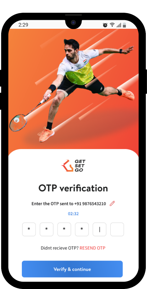
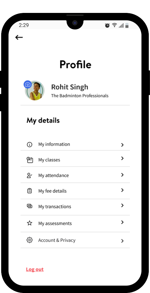
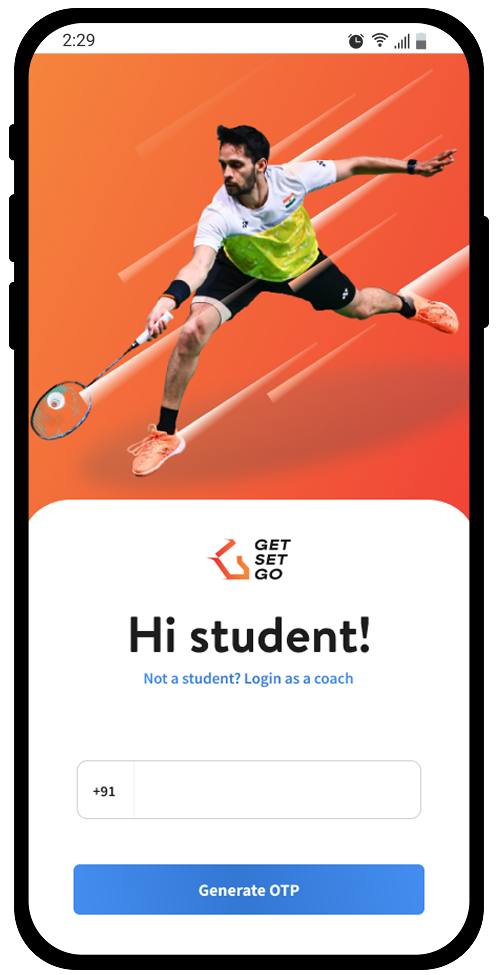
OTP-based login kept onboarding frictionless for a user base that skews toward students and parents who don't want to manage another password. From there, everything routes through a single "My Profile" hub — information, classes, transactions, and attendance all one tap away.
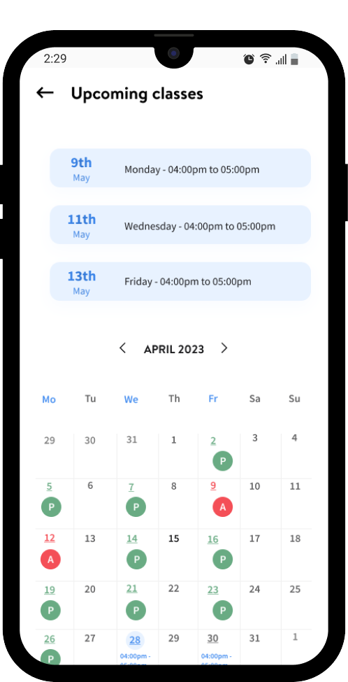
Attendance and schedule were what students and parents checked most, so the "Upcoming classes" screen gives both a forward-looking list of the next few sessions and a full calendar underneath, color-coded for Present and Absent days. That way a student can see what's coming up next and also scroll back to confirm their attendance pattern for the month, without switching screens.
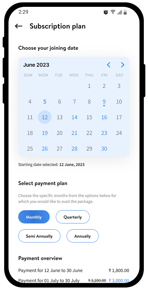
Subscription plans show the full cost breakdown up front. Choosing a joining date and billing cycle (monthly, quarterly, semi-annual, annual) instantly updates a line-by-line payment overview, so there's no surprise between what a student selects and what they're charged.
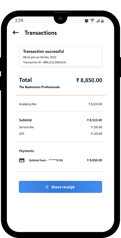
Every payment doubles as a receipt. The transaction screen breaks down academy fee, service fee, and GST individually, with the payment method and transaction ID inline — because "what exactly did I pay for?" needed to be answerable at a glance, and shareable in one tap.
The visual system leans into energy and motion-oriented imagery appropriate to a sports product, while keeping the actual UI — cards, lists, status colors — restrained and consistent, so the personality lives in the photography and accents, not in the interaction patterns.
This project was a good exercise in designing for a low-attention, high-trust context — most users open a sports academy app for ten seconds between other things, so every screen had to front-load the one piece of information someone actually came for. Designing for three distinct personas within one product also reinforced how much restraint matters: the student experience needed to stay simple and reassuring, while still sharing a consistent design language with the more operationally dense coach-facing screens.