Manipal Connect — Community Connect
A digital Neighbourhood Card and community portal that strengthens the relationship between Manipal Hospitals and the residential communities around them — built fast, with real users, using the Lean UX framework.
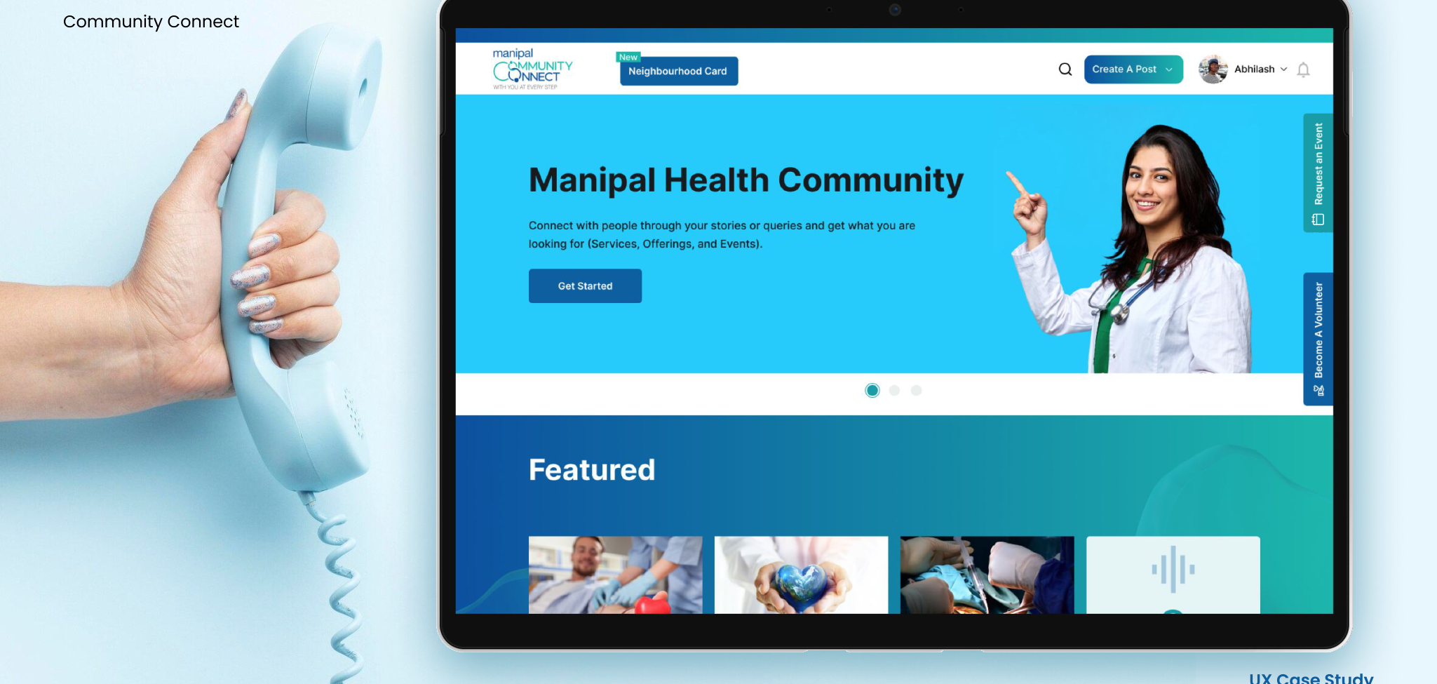
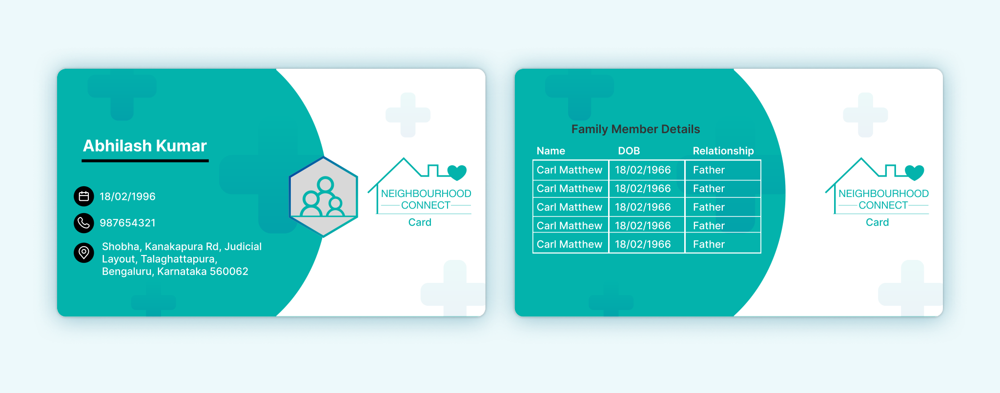
Manipal Connect is a digital initiative by Manipal Hospitals designed to strengthen its relationship with residential communities nearby. The core idea: provide accessible, proactive healthcare engagement through digital Neighbourhood Cards, event-based education, community storytelling, and digital volunteerism — rather than waiting for people to become patients before the hospital enters their lives.
The project ran on the Lean UX framework, which let the team deliver a high-impact experience quickly by prioritizing continuous collaboration, rapid experimentation, and validated learning over up-front, big-batch design.
Collaborative, cross-functional work. From day one, product managers, developers, marketing, hospital stakeholders, and community members co-created hypotheses and sketched early ideas together — keeping business and user needs aligned from the start rather than reconciling them later.
A problem-focused approach. Instead of jumping to solutions, we framed the core questions first: How can users easily manage family healthcare info? How do we connect hospital services with local residential clusters? How can users feel emotionally involved in community health?
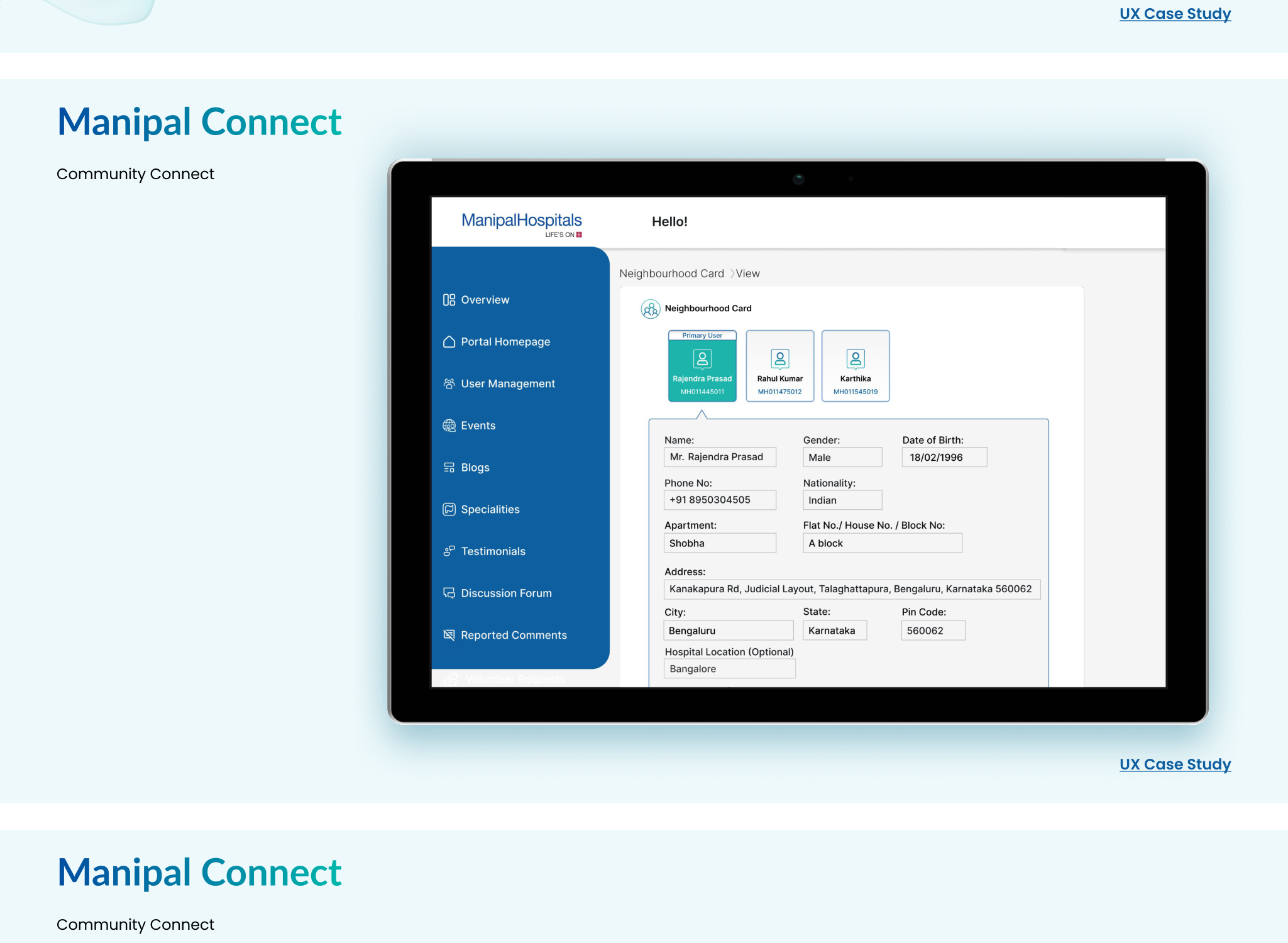
Hypotheses → experiments → learnings. The product took shape around testable assumptions. Hypothesis: a digital Neighbourhood Card would encourage more residents to engage with Manipal's ecosystem. Experiment: MVP card views tested with community users and internal admins. Learning: users valued personalized cards but wanted better visibility into family details.
Neighbourhood Card Admin Dashboard — a focused layout showing primary and linked family members, editable demographic and health fields, and a modular card structure built to scale as more users or family members join.
Digital Community Portal — a personalized homepage with clear "Get Started" and "Create a Post" calls to action, community storytelling and event-based engagement to reinforce trust, and low-friction volunteering flows to lower the barrier to participation.
User-centric information hierarchy — the "Primary User" is emphasized with a distinct green color code, family-member visuals add context at a glance, and left-panel navigation is sorted by most-used actions (Portal, Users, Events, and so on).
| Outcome | Impact |
|---|---|
| Faster onboarding for new communities | Admin time down 30% |
| Increased digital card adoption | 60% rise in sign-ups within 3 months |
| High volunteer engagement | 250+ volunteer registrations across 5 locations |
| Positive community sentiment | Higher reported trust during emergencies |
- Low initial engagement with the family card view → resolved with quick A/B testing on layout clarity and hierarchy.
- Admins confused by navigation → resolved by introducing an icon-based sidebar after usability testing.
- Lack of emotional connection → resolved by introducing community stories and local event showcasing.
Cross-team collaboration early on helped avoid misalignment with clinical staff and IT. Iterating fast with real feedback made the Neighbourhood Card genuinely more human-centered, and Lean UX kept the team focused on outcomes rather than deliverables for their own sake.
Manipal Connect isn't just a healthcare portal — it's a community-first product shaped by real users, rapid iteration, and lean experimentation. By applying Lean UX, the team built a scalable, intuitive solution that bridges the digital gap between hospitals and homes, fostering trust and health ownership in local communities. Next steps on the roadmap include localization, further WCAG accessibility improvements for elder users, and in-app health reminders tied to individual care milestones.