Unified Payments, with Gamification
Shifting a UPI payments app from a purely functional tool into an engaging, habit-forming experience — by unifying every payment mode into one platform and layering in gamification that made routine transactions feel rewarding.
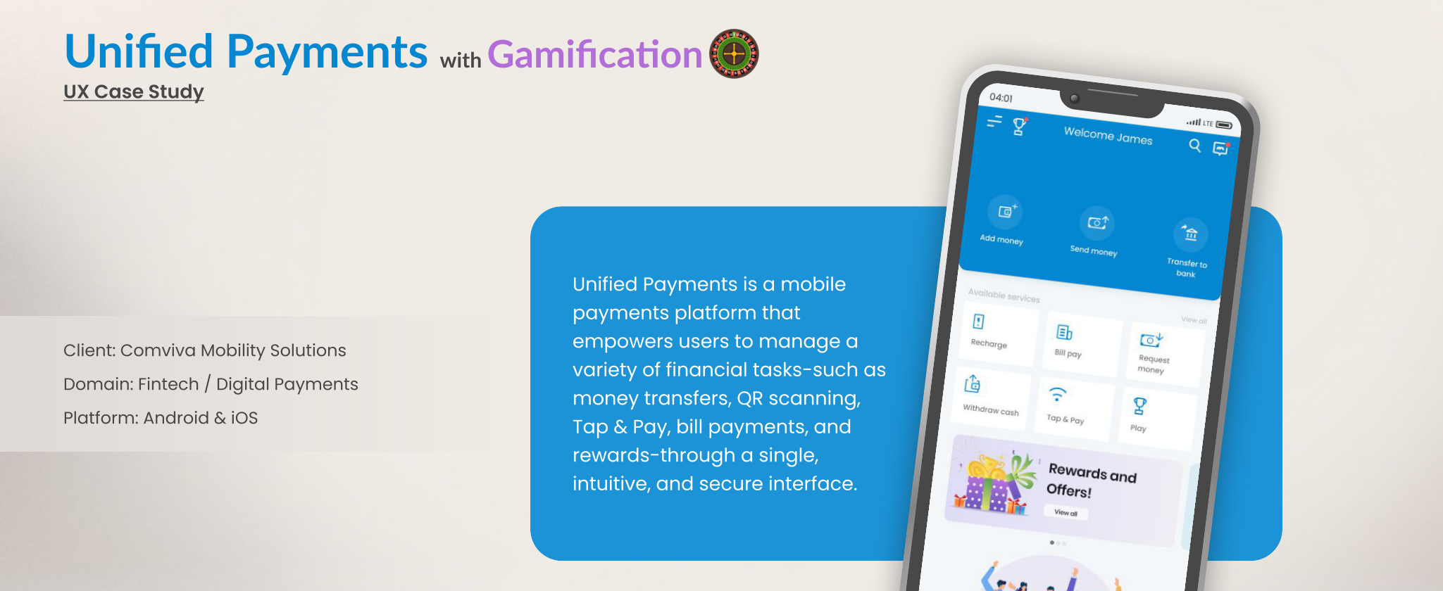
Digital payment apps had become purely transactional — open, pay, close. In a space crowded by UPI apps and mobile wallets, users treated them as utilities, not experiences. Comviva wanted to change that with a Unified Payments app: one platform for money transfers, QR scanning, Tap & Pay, and bill payments, wrapped in gamification designed to boost engagement, retention, and feature adoption.
Despite feature-rich wallets, most digital payment apps struggled with the same pattern:
- Low repeat engagement beyond essential transactions
- Drop-offs right after onboarding
- Little personalization or emotional connection to the app
- Minimal exploration of features beyond basic transfers
That translated into four concrete goals: unify UPI, QR, Tap & Pay, and wallet payments into one seamless platform; introduce gamification to drive daily logins and full feature adoption; build a modular, scalable, secure design system; and design for both tech-savvy and first-time digital payment users.
I combined stakeholder interviews, contextual inquiry, an online survey (N=200), and a competitive audit against Google Pay, Paytm, and PhonePe to understand where the gaps actually were.
What stood out:
- 65% of users performed only basic UPI transfers and rarely touched other features
- Users engaged more with apps that offered rewards or recognition
- Many were unaware Tap & Pay or bill payment even existed in-app
- Security and transaction transparency were the top-cited concerns
- Uses UPI multiple times a day
- Loves challenges and rewards
- Rarely explores new features without a nudge
- Pays utilities monthly
- Often forgets due dates
- Wants simplicity, not clutter
- Uses QR scan for business
- Needs transaction reports instantly
- Values speed over decoration
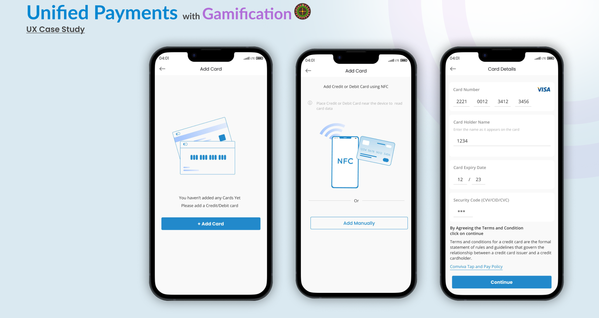
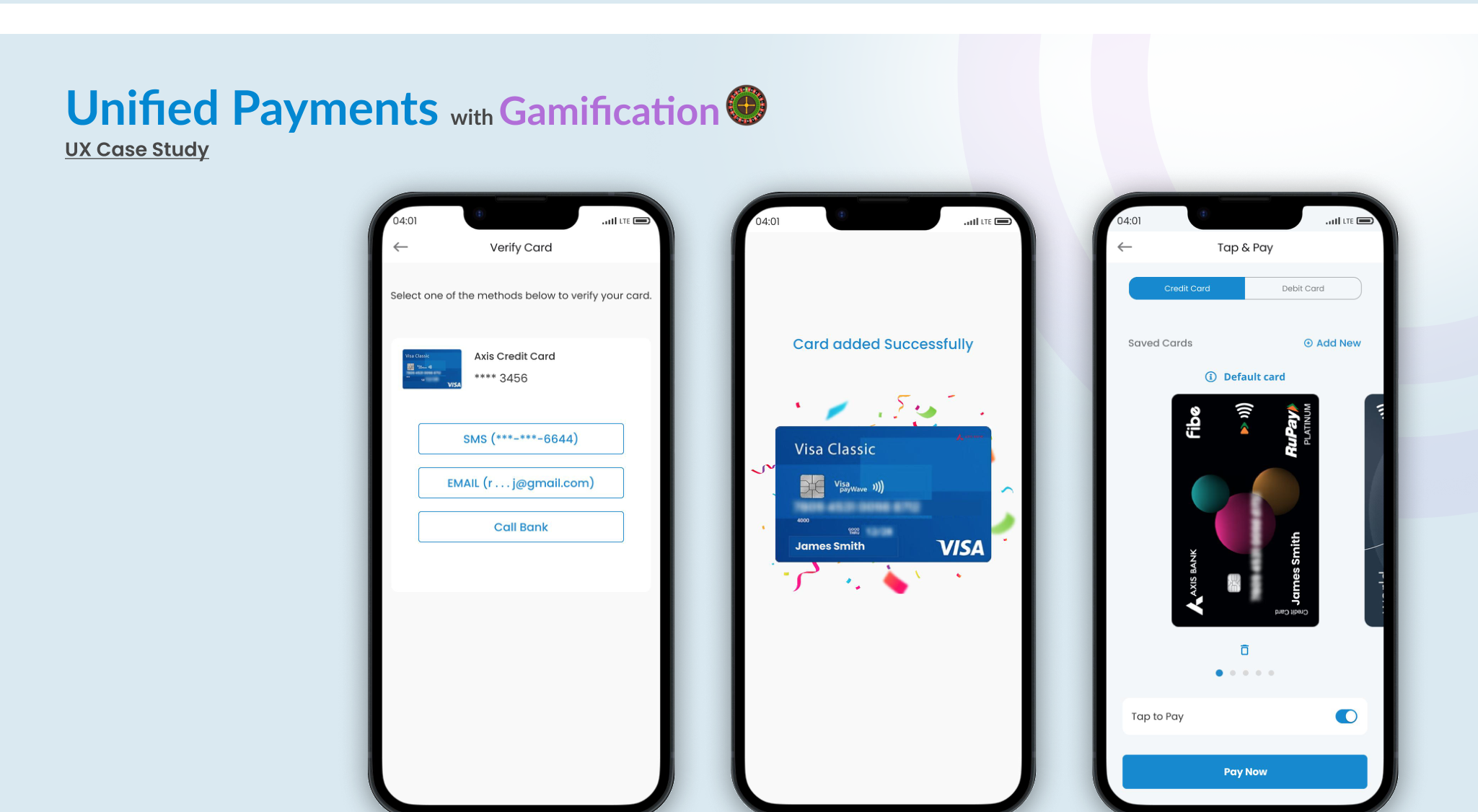
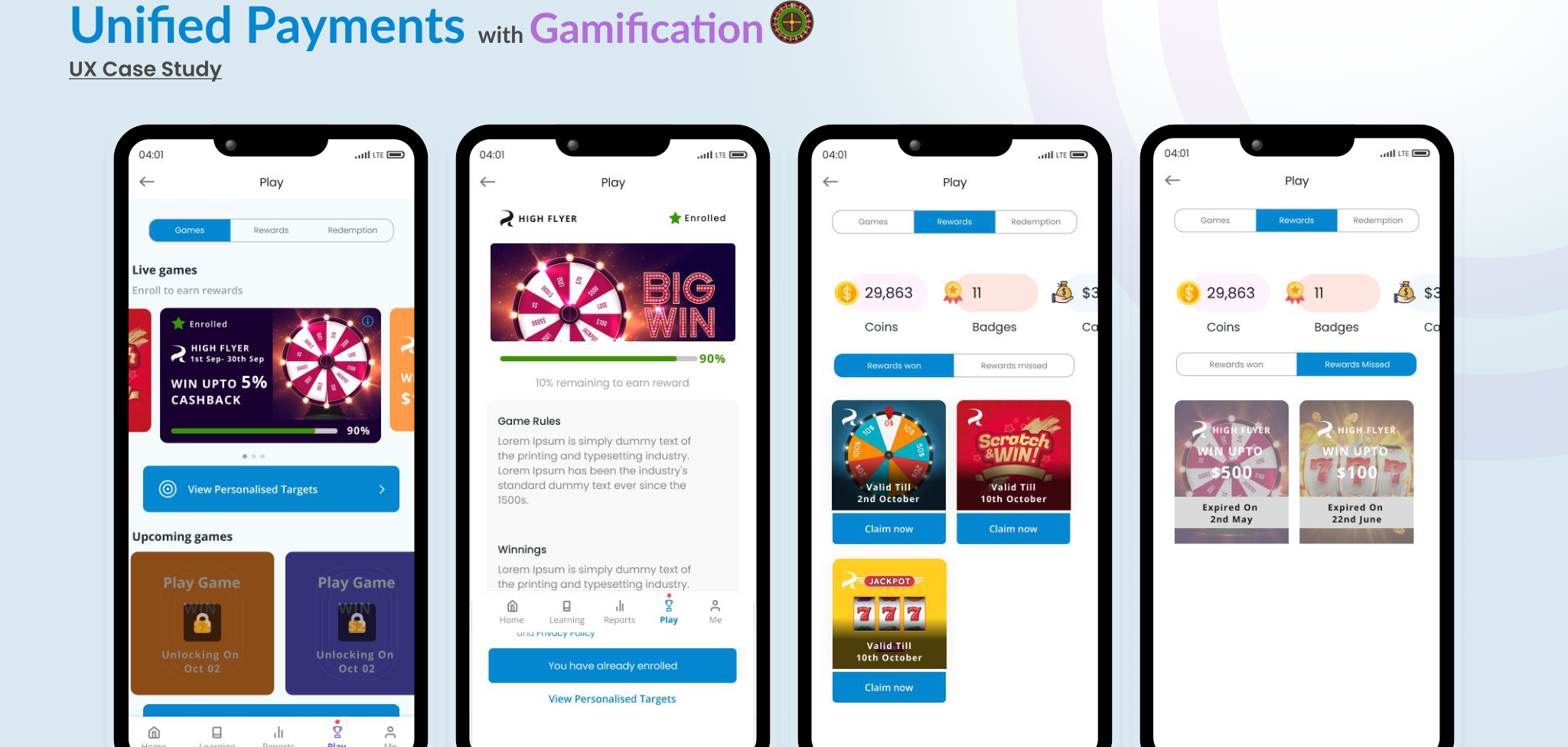
Information architecture was split into four modules — Payments, Manage, Earn, and Profile — with the "Earn" tab housing the gamification layer (leaderboards, challenges, badges) and "Manage" holding reports, linked accounts, and card details.
Design principles guided every screen: trust-first design with real-time confirmations and visible security indicators; progressive disclosure so advanced features surface contextually; visual delight through animation on points and milestones; and simplicity in depth, so the app never feels overwhelming despite doing a lot.
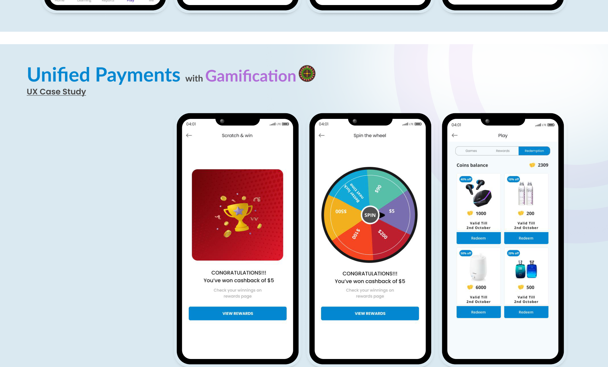
The gamification layer was central to driving repeat behavior. Rather than bolt-on badges, each mechanic was tied to a specific habit or feature we wanted users to discover:
- Daily check-ins — points for opening the app daily → habit formation
- Achievement badges — for first Tap & Pay, 10th bill payment, etc. → milestone motivation
- Weekly challenges — tasks like "pay 5 bills" → encourages feature exploration
- Spin & win — a wheel for random daily rewards → excitement and a small dopamine hit
- Leaderboards — compare with friends → social motivation
- Progress tracker — visual bar of points and upcoming rewards → intrinsic goal-setting
Visually, this meant a more colorful, energetic interface than a typical payments app — progress rings, spark animations, confetti on milestones — while staying disciplined about not letting the "gamify" layer overwhelm the "pay" layer underneath it.
Gamification only works if trust holds underneath it. The app was built WCAG 2.1-conscious with contrast-aware palettes and text scaling, backed by multi-factor authentication and end-to-end encryption on all transaction flows.
Usability testing ran across 2 rounds with 12 participants. Key observations: users found the gamification intuitive and enjoyable, and leaderboards sparked genuine friendly competition. Early confusion around how rewards get redeemed was resolved before final build, and Tap & Pay adoption improved noticeably once a short tutorial animation was added.
| Metric | Before | After |
|---|---|---|
| Daily Active Users | 25% | 44% |
| Tap & Pay usage | 22% | 38% |
| Feature discovery rate | 40% | 51% |
| Average session time | 18% | 26% |
| 30-day retention | 30% | 52% |
Gamification works best when it's integrated subtly rather than announced loudly. Onboarding turned out to be the real lever — micro-tutorials mattered more than the mechanics themselves. Balancing visual delight with performance was genuinely tricky on low-end devices, and rewards only sustained engagement when they carried real value, not just points for the sake of points.
"Payments can be more than functional — they can be enjoyable, habitual, and even a little addictive."